Verdant Village
June News Update
We’ve reached the end of the month again and so as usual I have an update on what’s been going on with Verdant Village. For the first time in a while I feel like I’ve actually made progress. If you’ve been reading these dev logs you probably know I’ve been working on custom house interiors for a while. This month was the first time since I finished that system. So, I actually have a list of things that got done, which always feels better than just saying you’ve done work on one huge system.
Best to start at the beginning though. So, in order I first cleaned up the tool tip logic just a bit. There are a number of systems that are in place but might be missing a minor piece of code to polish it. I tend to program large swaths of a system and then make some notes before doing a second pass a little later to spruce things up. I find its better to give a system a little bit of time to breathe. Doing so lets me look at it with fresh eyes so I’m more likely to find things to polish up.
As for the tool tip logic it wasn’t much, just a simple subsystem so that the tool tip will never appear off the edge of the screen. Simply put, if you hover something that makes a tool tip close to the right edge of the screen the tool tip will appear to the left of your mouse and vice versa. Then apply that logic to the top and bottom of the screen too.
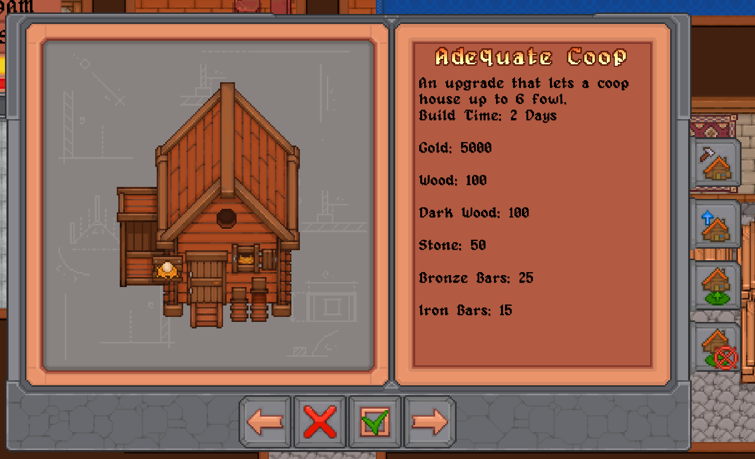
Next, was something far more important. When I got sidetracked on making custom house layouts I was actually going to start making the construction UI. Now that I’m finally done with custom housing, I moved back to the construction UI. For starters, below is a screenshot of the old UI.
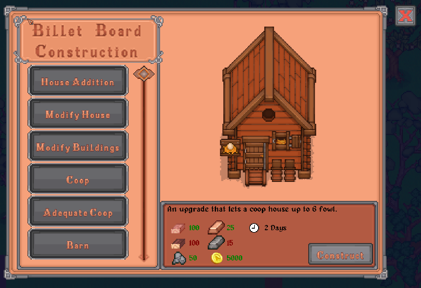
Now below this is an example of the new UI.
Sprite work on the new stuff is still in flux a bit. Anything you see could be tweaked, but the general layout is set. I think the best way to explain the changes is ‘streamlining’. The current live version of the game has a lot of buttons. I think I decided this because I play these sorts of games on mouse and keyboard (which based on what I seem to hear from others means I’m weird, but I already knew that). So when making UI I tailored it towards that sort of control scheme. The problem is, since the game will support controllers too, menus like this are really inconvenient. Having to navigate across even just four options is honestly not great and some UI is even worse than that. There are some pieces of UI like the inventory where streamlining might not be possible for a controller, but the problem should be alleviated where possible.
Even ignoring the controller issue the old UI wasn’t terribly great in my opinion anyway. In general, there are too many buttons and, in my opinion, too much text. This might sound strange but UI design should (I believe) always be concerned about new players. When you are familiar with a game you can connect the dots most times. Its when you are new that readability is most important. In the case of the old construction UI basically everything violates this, some bits more so than others.
To start, the buttons at the bottom to navigate the UI aren’t clear. The left and right arrows I would say are the only passable thing, although still a little unclear. The X button to close out the menu can probably also be understood, but it runs the risk of causing confusion because the live version of the game just throws UI close buttons in random places a lot of the time, so you can’t be sure what it does. A simple example of this concept is that in Windows the close button for a window is always in the top right. You’ll always know where to look for it and what it does. That kind of consistency is extremely important. Finally, the check button next to the X suffers from not having a clear purpose. Again, you can probably deduce what it does, but its left to interpretation.
The next issue is the text that displays what you need for construction. There’s too much text, and while everyone knows what wood, gold, stone, etc are, players may not know how to identify it in game. In game all items are icons, not text. Therefore, a purchase that requires these items should show the items, not a word describing the item.
In addition, the old UI only indicates when you have enough of the item with a green check. It doesn’t indicate when you don’t have enough of the material or gold. This leaves ambiguity which should really be avoided in every UI.
Finally, the buttons on the right. Not only do these add to the button count, but it also isn’t clear what each one does. The worst case being the difference between upgrading buildings and building new buildings. These buttons create two separate lists which unintentionally hides away options from players. Someone may just not notice the buttons and completely miss all the extra options.
Now, the new UI I think addresses most of, if not all, of these concerns. The name of the shop has been added which, while not that important, gives a bit of context for what you are looking at. Instead of having navigation at the bottom there is a simple list of options with a slider. This not only shows more options at once but also simplifies viewing and selecting. Instead of an ambiguous checkbox for starting construction there is a button clearly telling you what you are clicking on. The X button is also in the top right, which is where it will be on all UIs.
The buttons on the right of the UI have also been done away with. Upgrades are listed among the buildings getting rid of the need for two separate lists. Moving and deleting buildings has been condensed into one mode and therefore one button “modify buildings” which simplifies the process.
Lastly the required items for the building are displayed using the sprite rather than text. The amounts of each tint red or green based on if you have what you need to construct the building. The time to build is also given its own cost entry so that the detail doesn’t get lost in a paragraph of description text. Finally, something that can’t be seen in the screenshot is that if you hover any item sprite you’ll get a tool tip telling you what it is, so even if you haven’t seen the resource before you can at least get an idea of what you are looking for.
I’m sure it could still be done better, I’m hardly a game design expert, but I think this is a marked improvement over what was there before. This sort of make over is what can be expected for all the UI in the game. I don’t want to just remake what was already there in a new engine, that would be a waste of time when so much could be improved.
But enough about the construction UI. On top of all the changes all the code has been put in place to make it function appropriately so we are done there. The next thing to address was the actual buildings themselves. I’d already made coops and barns work because I’d implemented livestock a while back. Obviously, you can’t have animals without a place to put them. However, the other buildings hadn’t been setup. So I made wells and silk farms function. That still leaves fisheries and stables, but both are being put on hold for different reasons. The fishery UI needs to be completely altered, looking at the old UI I think I might have been in a fever dream when I okayed it. For stables the plan currently is to massively overhaul how horses work including things like stats, multiple horses, etc. So I didn’t want to jump into that before I was ready to tackle the whole thing.
During the process of setting up silk farms I had to account for them changing how they look during different seasons. This is in the live version of the game but it was really more of a tacked on feature because the engine was restrictive and I hadn’t setup buildings in a way to easily change their sprite during season change. This system is now actually appropriately implemented which means things like snow on the roofs of buildings in winter and other such things.
Finally, we come to shipping. This was the last thing I worked on this month and am still working on. Although that’s a bit deceptive because shipping really covers, selling items, ordering items, receiving items, and technically mail since its in the same UI. As expected, working on one system quickly spiraled into multiple systems.
To start, you can now sell items via the shipping chest. It functions in the same way a regular chest does but at the end of the day all the items in it will be sold. This is all in place and working. Of course this led me to what I call the ‘End of Day Recap’ screen. Part of selling your things is that the game will tell you what you sold at the end of the day and how much you made. So as with every other system I took a look at what I already had. In the live version of the game you get a simple screen that breaks items up into categories, which I don’t think are ever explained to the player. I forget the reasoning for this but I think it was something to do with displaying too many items on screen that led to that implementation.
In any case, very basic, and honestly not that insightful unless you remembered what you put in the chest and could reason out what category it would fall under. Even still you’d be left with a lump sum of profit and not really know what sold for a lot and what didn’t.
Now, fair warning, the below screenshots are very much work in progress. The logic is all working, but the art will be changed in time. My artist is currently busy making furniture sprites, oh so many furniture sprites, but I’ll eventually get her onto this. The important thing is the functionality.
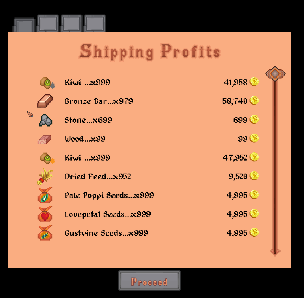
This screen in the recap will show you each item you sold, along with how many of it and how much money each item stack sold for. There will also be a total at the bottom but I didn’t get around to it quite yet. However, that isn’t all. I did some thinking (as I’m prone to doing) and decided that this recap could really be a lot more useful. To tangent slightly, one of the bigger deviations in this game from other harvest moon type games is that you don’t have to sleep. You can just keep going through midnight if you want. As I recall there’s literally a perk called insomniac for staying awake 7 days straight. When I made the decision to make the game this way I didn’t really think about how it might change things. I’m not going to take this away and force players to sleep every night but changes need to be made to support this concept. To put it simply forcing a player to sleep each night effectively forces a routine. Every day the player is going to start and end in the same spot. This, combined with repetitive daily tasks, creates an environment where it makes sense to have a list of things that you do each day. Good examples would be, watering crops, feeding animals, etc. Because a basic routine is so ideal most players have one. Because you have one it keeps you fairly tuned into everything going on.
However, if you aren’t forced to sleep each night the game can tick over to midnight and you could be on floor 37 of the mines looking for 5 more iron ore cause Sven is too lazy to provide materials for tool upgrades himself. Suddenly you’re in a completely different situation. A new day has started, you have things you need to do but you are in a strange starting situation.
The idea of this new recap is to give you a gauge of where things are at and help you get a snapshot of everything so you can plan a little bit more at that moment and formulate a plan for the day if you need to.
So, the recap now has tabs. The first being profits from shipping, as discussed above. The second is crops. Shown below, as I said above none of the sprite work is final.
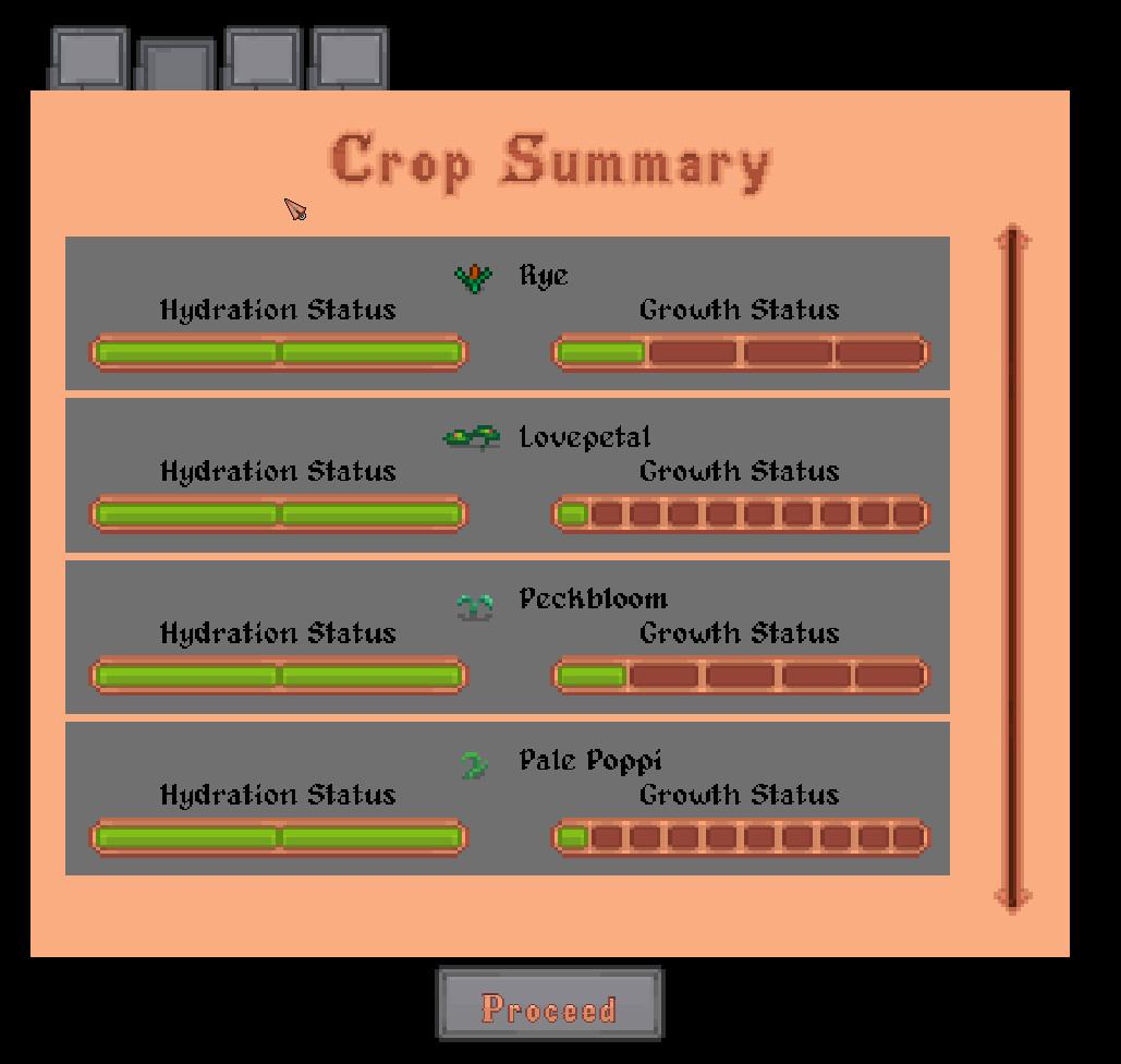
The crops tab will show you the current status of every crop you have planted. How much water does it have, and how long till it is fully grown. This way you know if you’ve missed watering something, or maybe you need to run back to harvest. This may get more in depth if other things are added to crops as well. There are things like fertilizer and growth powders. If I decide to add more stats to crops you can expect them to be shown here. Next is a far more complicated one, animals.
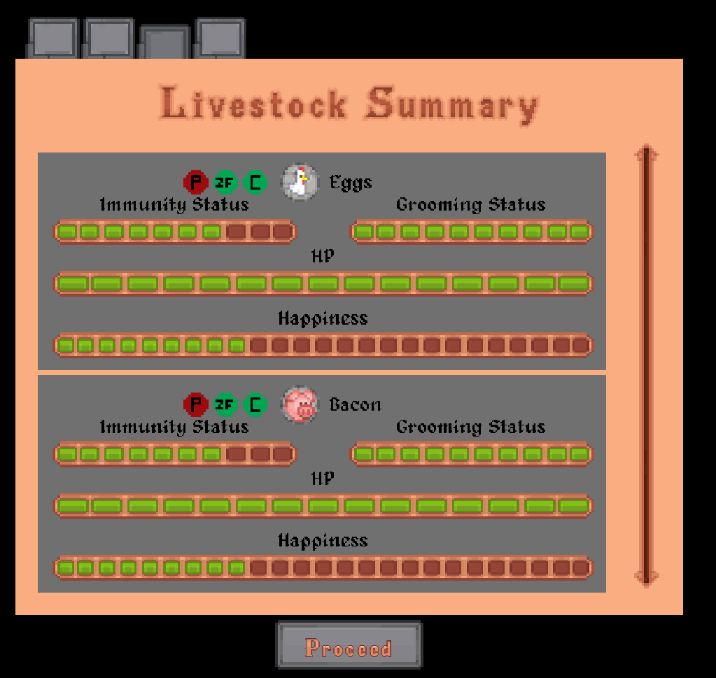
As you may remember, animals got a lot of changes. Mostly, they were made far more complicated as a way to combat them being basically just an easy infinite money source. They produce goods of varying quality based on their happiness. Happiness is dictated by what they eat, if they have a pasture, grooming, immunity, diseases, etc. While all these things can be seen in a coop or barn you can now see them in the recap. The big green gauges are fairly self-explanatory, just an indicator of where that stat is. You might also notice the little green and red circles next to each icon. These indicate other bits of information such as, is the animal fully grown or not, what tier of pasture can they access if any, are they pregnant, do they have a disease, what food did they eat last, etc.
I understand that this is a lot of stuff to keep up with so I’m hoping this will serve as a simply way to condense all the info and make it a bit more digestible.
There is one final tab at the moment which is player stats. I don’t think this is exactly needed but I thought it would be a nice little page of information to see how you progressed that day. The plan is that it will track progress in tool proficiencies, perks, challenges, etc. Similar to what you see with crops and animals you’ll have indicators of how much XP or progress you gained in each particular thing that day. Again, probably not needed but I think it might help if a player is looking for a direction they can look at their stats and maybe see that they are close to getting a perk or stat increase and then focus on it. I think it might also be a good idea to expand on this sort of thing in the player pause menu as well. Basically have this information available to the player anytime they pause and obviously have it update in real time. This way if you have a ton of stuff to keep track of you can sort of check your work as you do it. I feel like with all the systems it could get overwhelming if you choose to dabble in a lot of stuff and having a way to track it will help.
Okay. I think that’s it. I went on for a while here but I like to explain the choices I’m making here. Any feedback is obviously appreciated. Things I think are good ideas can obviously turn out to be poor ones as clearly evidenced by things like the old construction UI.
One other minor thing that I don’t think will be a big deal but I thought it worth mentioning. I’m still writing lore for the world on the weekends, or dear so much lore, so much lore that is probably irrelevant to a farming game lol. I’m thinking of using this world as a setting for games in the future so it wouldn’t all be wasted, but that’s beside the point. I just wanted to mention that some characters may be getting reworked a bit to fit into the lore. As the world gets fleshed out I’m finding that the characters will need to be altered a bit to match. I don’t think any of the characters that exist are particularly well characterized at the moment but I thought I’d make a broad statement saying that they are all subject to change. Realistically I see this as a good thing. The whole point of making lore was to make the world feel more natural. If I’m feeling characters need to be changed that means there is lore that can color each of them in a more interesting way. So just a heads up there.
I’m not exactly sure what this month holds. I’ll be finishing the recap, and then shipping first. After that I’m not sure what I’ll turn to next. There is plenty to do of course, it might be NPCs or it may be something more mundane like setting up saving and loading. Time will tell. Anyway if you made it all the way down here thanks for reading and sticking with me through this very long process. I hope you all are having a good summer, I’ll be back in a month to ramble on about other game design things.
Leave a comment
Log in with itch.io to leave a comment.