August News Update
Just like that August is over. I say that a lot, but I really feel it this time. This month was hampered slightly by other events. To be brief, I attended a wedding in Europe which meant I lost about 10 days of work. And since that person is potentially reading this right now, I should clarify that I don’t regret my decision to attend at all, however it did mean a little less got done game wise.
So, let’s jump into it because despite the loss of time there are a few updates to give. I believe at the end of the last update I mentioned that the dialogue system would be next in line. I’m happy to report that, bar a bit of UI tuning, that system is complete. This is another situation where that sounds like very little, but its actually a fair bit of progress.
Before we get to what’s new though I should preface with the old. If you’ve played the current version of the game you’ve probably talked to an NPC within it. I mean I really hope you’ve talked to at least one person. Even if you haven’t though you’ve seen the intro cutscene so you should be familiar with the dialogue system to a degree.
The dialogue system was created pretty early on in development and suffers from (like many other things) a lack of forward planning. At the time I made it I didn’t quite realize just how much was going to be steeped on top of the system. This resulted in a lot of bits being tacked on as time went on. So below is a basic image of the old system.
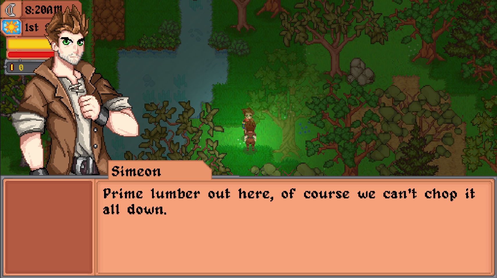
It serves its purpose although you might notice right off the bat that the clock is still visible which clutters the UI. Aside from that the major visual difference you’ll see is the large blank slot on the left side of the screen. This is used for buttons to navigate any menus within the dialogue system, except for when it isn’t. Below here you’ll see an image of a quest.
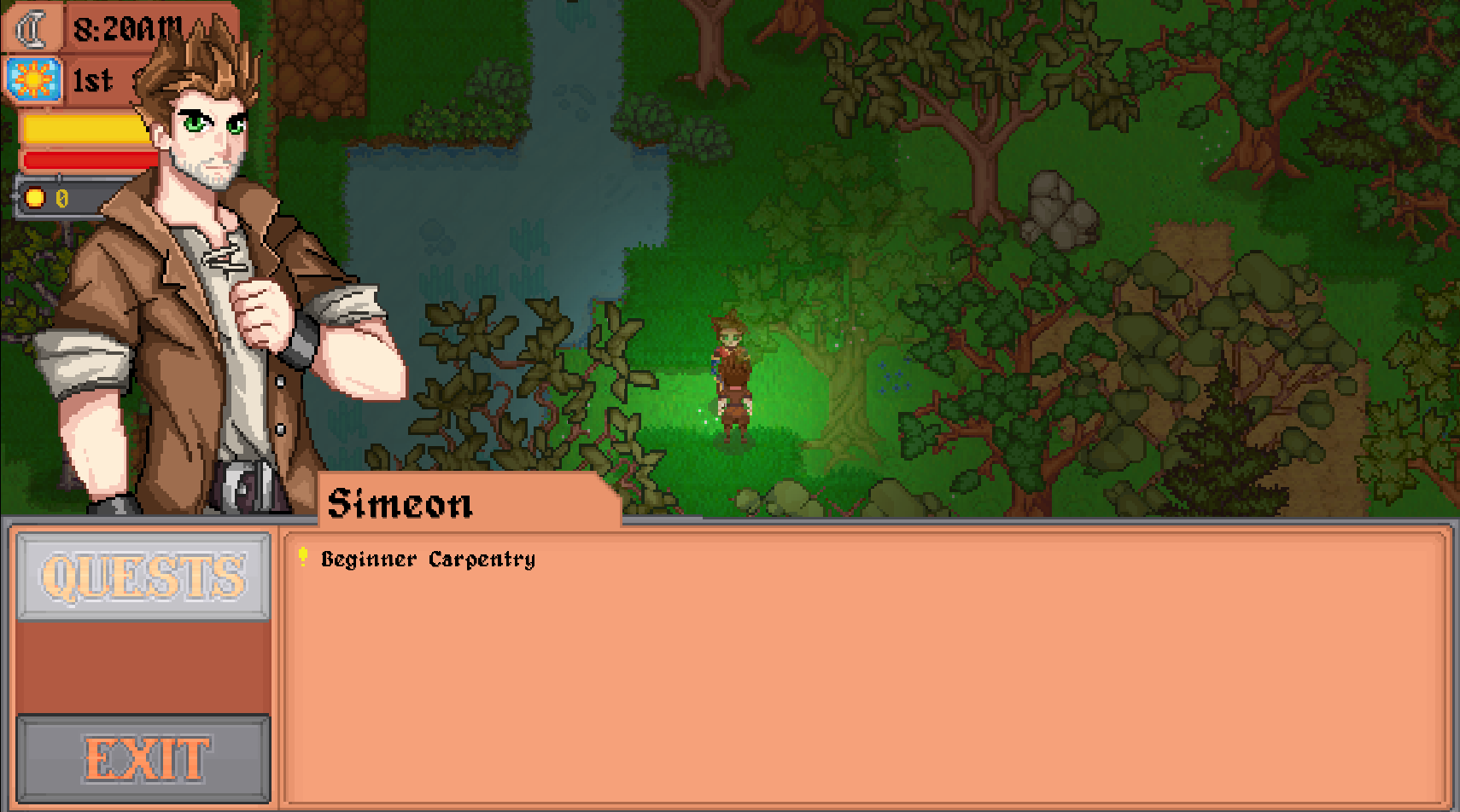
As mentioned above there are two buttons on the left one to show the list of quests, another to exit the conversation. Then, because I guess I was feeling experimental that day, you can also click on the text “Beginner Carpentry” to start the related quest. To my knowledge this is the only system in the game that requires you to click on text like it is a button.
If you’ve been reading these dev logs for the last few months you’ve likely heard me talk about UI consistency and the lack there of in this game. This was one of the major things I wanted to address in this system. Not to mention there would have eventually been a “Topics” button to navigate another set of choices. And the fact that the way you leave the UI is through a button that says “Exit” rather than the usual red X button.
Before we get into all that there are a few other things to mention however. As I said briefly the old dialogue system was made pretty early on and as systems were added in (quests, cutscenes, tale conversations) more and more was tacked onto the system, straining it greatly.
For instance, at the start of this I mentioned that if you’ve watched the opening cutscenes you are familiar with the dialogue system. That’s sort of true. It looks the same, but in reality there are two separate dialogue engines in the current game. The first handles regular conversations and then a second one had to be concocted specifically for cutscenes because the original was too convoluted to be applied in a cutscene. I don’t think I need to explain how bad that is in terms of design.
Another instance of bad design was related to the blacksmith. If you’ve ever upgraded a tool in the current version of the game you might remember that the blacksmith says a line of dialogue when you start an upgrade. He also has a unique line of dialogue when an upgrade is in progress and a specific line when the job is done and you pick up your tool. This is a simple interaction, but because of how the dialogue engine was written the whole thing effectively had to be uniquely dealt with.
Whenever you start a conversation in the game it checks to ensure the conversation isn’t one of those three specific blacksmith lines. If it is one of those lines the game basically shoves the entire dialogue system aside and has a hard coded set of instructions to handle the interaction. TLDR, not well made.
Aside from this there were smaller issues. As mentioned, things like quests weren’t originally considered so weird UI elements like the text buttons were made. There was originally a rumor system that was scrapped early on, but remnants still remain in the system. There were other conditions that dictated character dialogue which were dropped. Things like characters having multiple portraits for different emotions and switching through them during conversation wasn’t originally intended. And while tales would get that functionality regular dialogue never got it due to complications.
Speaking of tales, those were an idea that spawned much later. Tales for reference are the longer more character driven conversations that each character will have. A simple comparison would be the heart event conversations from Stardew Valley if you are familiar. Tales also involved player responses, another thing that wasn’t planned on.
Despite what you might think I don’t bring all this up to simply expose my own missteps. I hope that pointing these things out in some way helps people to understand why I decided to reconstruct this game from the ground up. Also, on the off chance that any other game developers are reading this I hope it serves as a cautionary tale. Plan your games out kids, take it from someone whose game plan was basically, “eh, how complicated can it really be?”.
So, I’ve spoken on what’s wrong with the current system, which is basically everything. So what has changed? Well, from a visual perspective not a ton although there are some noticeable differences. Most of the work is behind the scenes to make the system far more robust in general. So here is a simple image of dialogue to start.
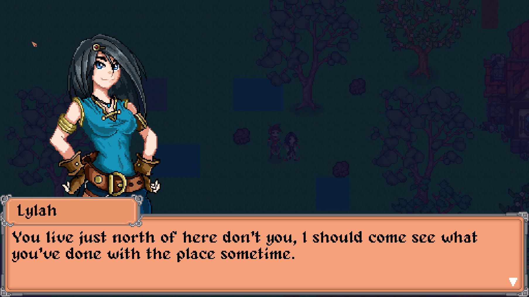
As you can see, not a ton changed aside from the lack of button space on the left. Also the clock isn’t just weirdly still hanging in the background. One other minor change you might notice is the arrow in the bottom right. It will shift up and down slightly and basically just indicates that the line of dialogue is complete and can be advanced. For those unaware dialogue types itself out character by character instead of just appearing all at once. So onto other things, below an example of the new conversation menu.
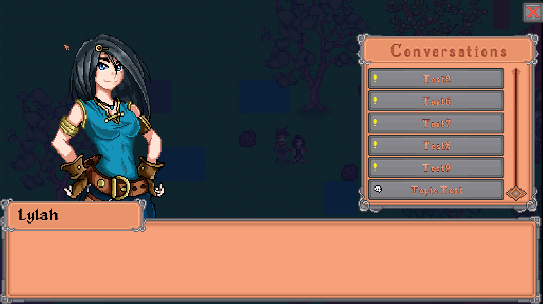
The flow is a bit harder to understand with just still images. To explain, the player will initiate conversation with an NPC. Doing so results in a simple line of dialogue like you saw two images ago. Once you reach then end of that text you’ll be shown the resulting menu you see above. This allows you to pick further conversations via topics or quests.
The visuals likely speak for themselves, but at a basic level this UI is meant to be more inline with other UI in the game. Clicking any button will launch you into the respective topic or quest. Topics and quests are indicated by a specific icon, and as before quests will change their icon based on it being new, in progress, or ready to turn in. Finally, we have a response menu that you’ll see below.
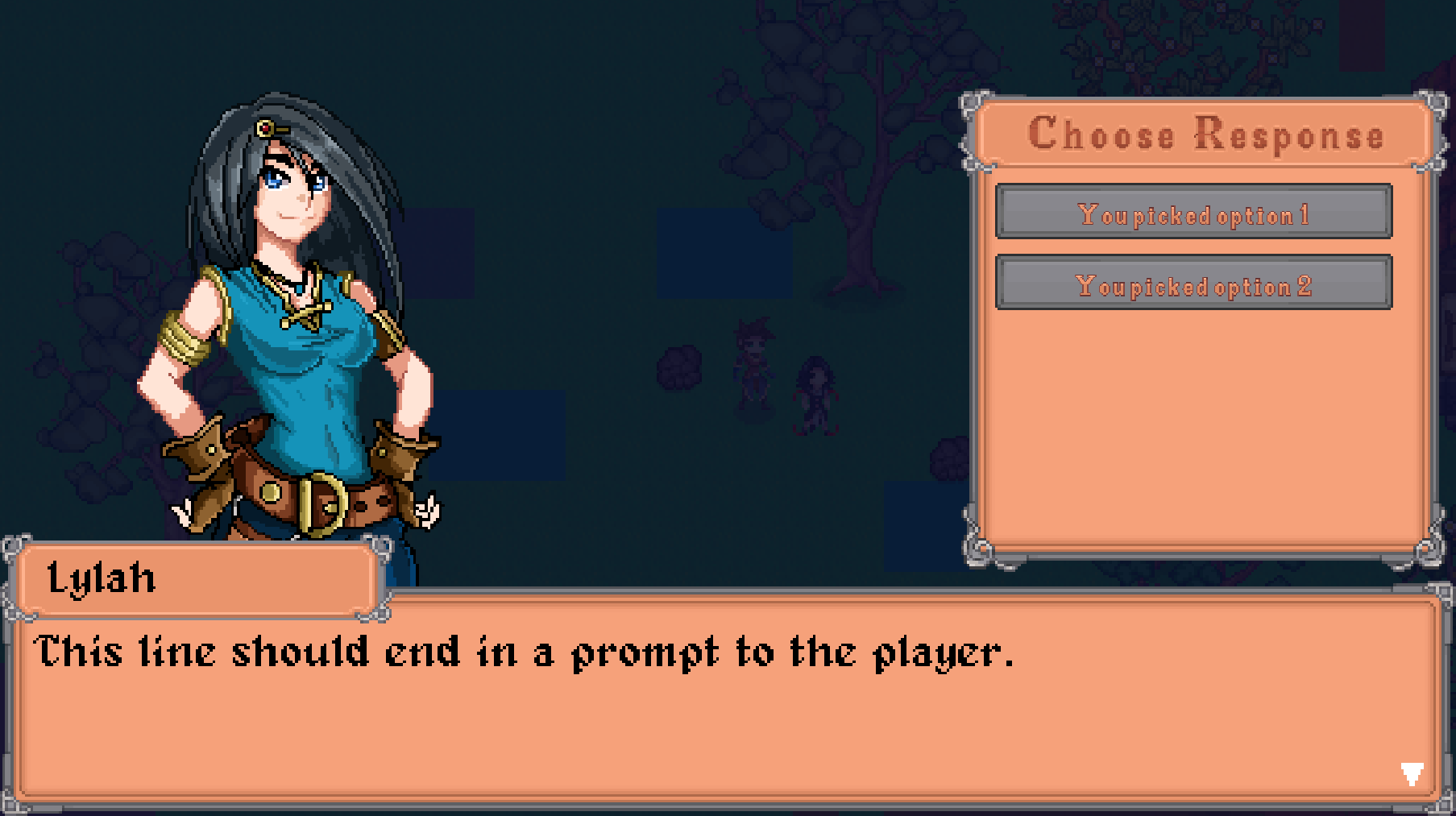
This is where you’ll have to excuse the UI a bit. As mentioned near the start some adjustments to how it looks and button size still need to be done. This response menu allows the player to do things like accept quests or, in most cases, choose a response during a conversation.
So that is dialogue in a nutshell. To keep it brief all the things mentioned above have been addressed behind the scenes. There is now one unified dialogue system for in game and cutscene events. The UI is more inline with the game. There are allowances to alter portraits in dialogue, and you can pick dialogue responses in conversation.
Aside from that the dialogue system in general is implemented. Everything you have seen is working as intended. So you can talk to NPCs, accept, decline, and turn in quests. You can also start topics and pick responses within them.
The only thing that hasn’t been done, which is likely next is that there is no visual way to track quests at the moment. The quest log is likely my next project. However, this should just be a mostly simple matter of visualizing data.
Aside from dialogue there is one other thing to address from this month. That would be quests. If you’ve played Verdant Village for any length of time you’ve probably done some quests. In general these are basically just tasks to fetch particular items for NPCs. Quests usually unlock something for you, furniture schematics, new systems like archeology or alchemy, or sometimes new areas. And so we come to the point of interest, recipes, specifically of the cooking variety.
Cooking is sort of an oddball system. However, to put it simply, I personally find that getting a recipe isn’t that great of a reward. Cooking is such an optional thing in these games that I think there are large swaths of players (myself included usually) who never cook anything.
Having quests, honestly a large number of quests, give a recipe as a reward I think feels bad. As such I’ve decided to basically take these quests out. Instead, a new system will be put in place related to an NPC. Effectively this system will be you bringing him ingredients and that will reward you with the recipe and the cooked item. Ultimately, I think this will trim a lot of fat from the quest system and hopefully make quests more enticing.
That said, I know that’s a large chunk of quest content. I don’t think I’ve said too much about it, but I wanted to note here that there is something that will be added to supplement quests. I never got around to adding it in the current version, but I’ve always referred to this system as “secrets”. These secrets don’t involved dialogue with NPCs, but are effectively little quests you can find naturally in the world. Unlike actual quests they don’t involve collecting items on a list but rather solving puzzles (sometimes by bringing the right item) but generally they are a little more interesting than just a quest checklist to fill.
Hopefully that inspires a bit of hope in that regard. I don’t like to just take things out. In this case I’d say cooking quests are just being altered a bit instead of disappearing entirely, but I know it might not seem that way to everyone.
Anyway, I think that’s everything, thank you all for your patience and interest, it really does mean a lot to me. I will have more updates at the end of the month as usual.
Get Verdant Village
Verdant Village
A fantasy farming simulation game
| Status | In development |
| Author | Exodus Software |
| Genre | Simulation, Role Playing |
| Tags | 2D, Farming, Life Simulation, Pixel Art, verdantvillage |
| Languages | English |
| Accessibility | Subtitles |
More posts
- March News UpdateApr 01, 2025
- February News UpdateMar 01, 2025
- January News UpdateFeb 01, 2025
- December News UpdateDec 31, 2024
- November News UpdateNov 30, 2024
- October News UpdateNov 01, 2024
- September News UpdateSep 30, 2024
- July News UpdateAug 01, 2024
- June News UpdateJun 30, 2024

Leave a comment
Log in with itch.io to leave a comment.