July News Update
Tomorrow is the start of August so let’s jump right in. This is one of those months where a lot happened, but it was condensed into just a few systems so on paper it feels a bit sparse. As usual, I’ve basically been continuing with the reimplementation of various systems in the game. I was also trying to do some research into future systems and tuning up things where I thought it was needed.
So, let’s start at the beginning. Last month I had most of the end of day recap in place. As a quick explanation when the clock hits midnight the game will pause for a moment and show you a variety of information about the day that just passed. You can check the previous post for details, but its generally things like money earned from shipping, animal and crop statuses, etc.
The start of this month was spent finishing up this system, or at least finishing it to the point that it can be done. At least one addition is guaranteed and others may be tackled if they seem worth it. As with last time you’ll have to ignore some of the art as it is currently temporary.
The first section that was added was the player stat section. There was no old equivalent to this so all I have to show is this version. Basically, the page will display how much xp you gained for various tools and professions as well as how far away you are from your next level.
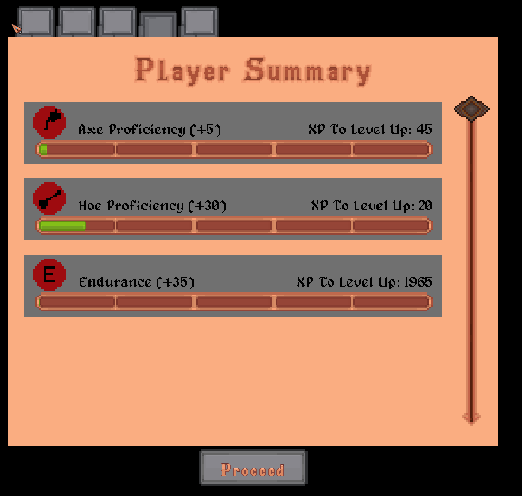
The idea with this is sort of two-fold. First its nice to be able to just get a quick look to see how close you are to leveling up. Aside from that I find it can be nice in games like this to be shown small goals you can work towards. These games tend to be pretty open, letting the player pursue whatever they want. While I obviously don’t want to railroad anyone I think its sometimes nice to be shown something you can work towards if you need a direction to work in.
The other thing about player stats that you might have noticed me mention before is professions. If you’ve played the current version of the game you are probably familiar with perks. For those who aren’t, there are currently two things you can earn to improve your character. Tool skills, which you get by using your tools, and perks. Tool skills effectively just reduce the amount of stamina taken when using a tool.
Perks are more interesting in that they augment certain parts of the game. Things like gaining more resources from alchemy, a chance to cook double of something, instantly breaking rocks when mining, getting more honey from apiaries, etc.
When I was implementing the player stats section in the recap I looked back through these. I’m trying to give each system a once over as I put it in to make sure its up to par. My determination on perks was that the idea was alright, but the implementation was sort of scattered. Several of them were odd, some unexciting, and most importantly there were many systems that had no perks associated with them at all.
I decided that something of an overhaul was needed. So the perk system will be replaced with professions. The goal is to categorize things a bit better and give more of a sense of progression within a particular activity. Each profession has 5 levels with each level unlocking something or giving a benefit of some sort. I’m attempting to avoid spoilers here so I’ll give farming as an example. Without stating too much you’ll unlock fertilizers, a new type of thing to farm, upgrades, and automation throughout the five levels.
I don’t want to oversell this however. Some things you will unlock are slightly changed versions of some of the old perks. That said most of this is new and builds off the changes that are happening to systems in this new version.
In total there are 17 professions each with 5 levels so 85 unlocks (opposed to the 44 perks in the current version). Basically, if there is something you can do in the game its probably a profession. Examples would be Smith, Farmer, Rancher, Alchemist, etc. There are a few in there you might not expect as a couple of new systems are in and some things were expanded and I felt a profession was needed. I should state that none of this is implemented yet. It is entirely planned out however much of it relies on interconnecting systems. Because of that it serves to get a base version of the system in and then build onto it afterwards.
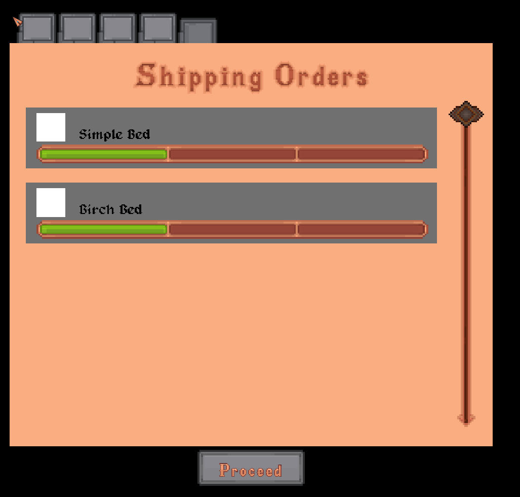
That is it for that section. A lot of stuff happened but there is obviously still more to do. Now, after that massive tangent, we can move on to the second page that got added to the recap. This again has no counterpart in the current game but the recap will now display your current shipments. Again, UI isn’t finalized, but you should get the idea from the image below. This should serve as an easy reminder for what is ready to pick up and what isn’t.
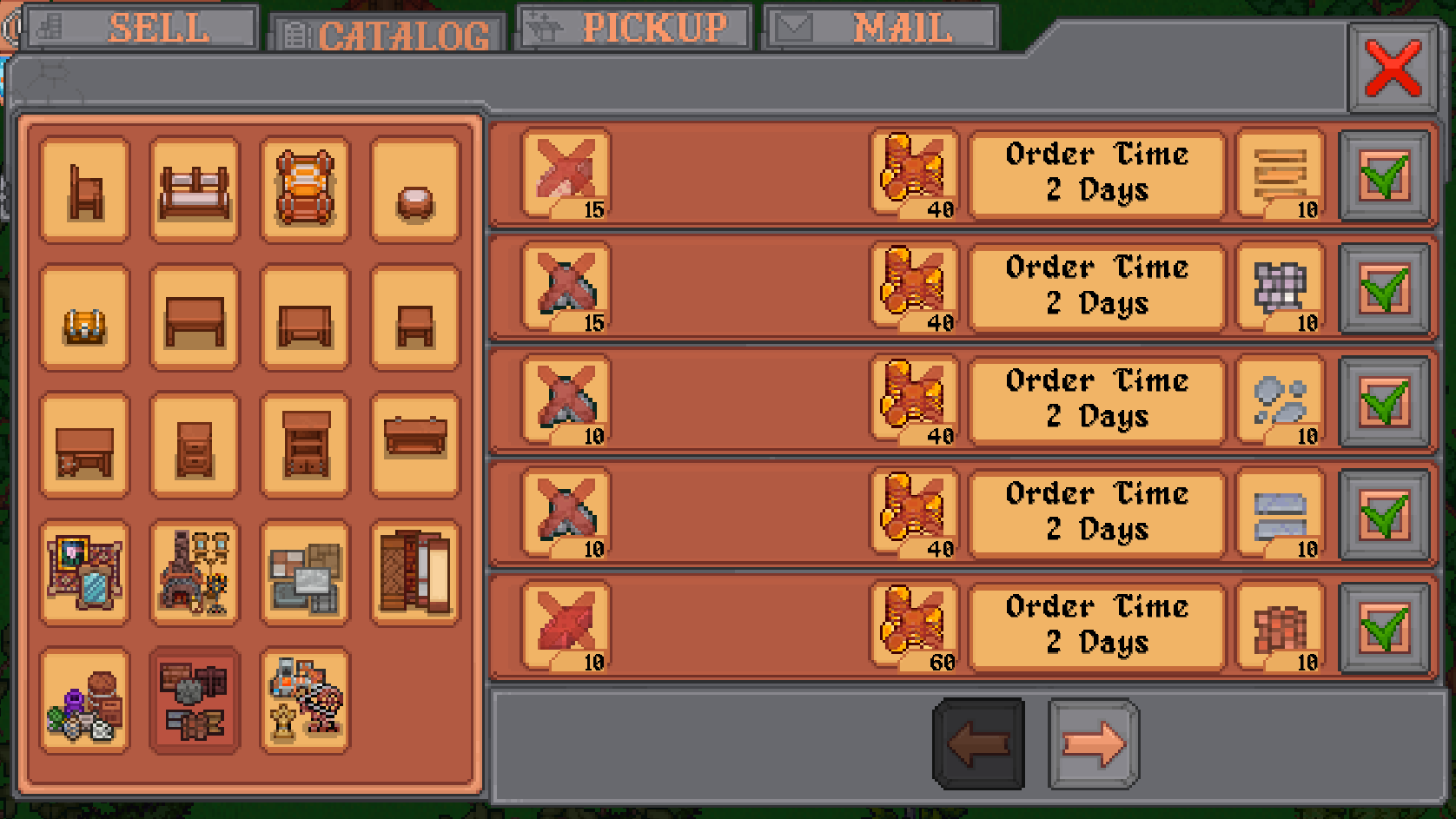
Now, if the recap shows shipping objects you can probably figure out the next system that got added. Shipping is now back in the game. This probably doesn’t sound like a ton, but shipping is basically a huge database and UI task. So, while it might look like a simple screen there is a lot going on under the hood that made it a somewhat arduous task. Since the current version of the game has shipping I’ll start with pictures.
Old Version
New Version
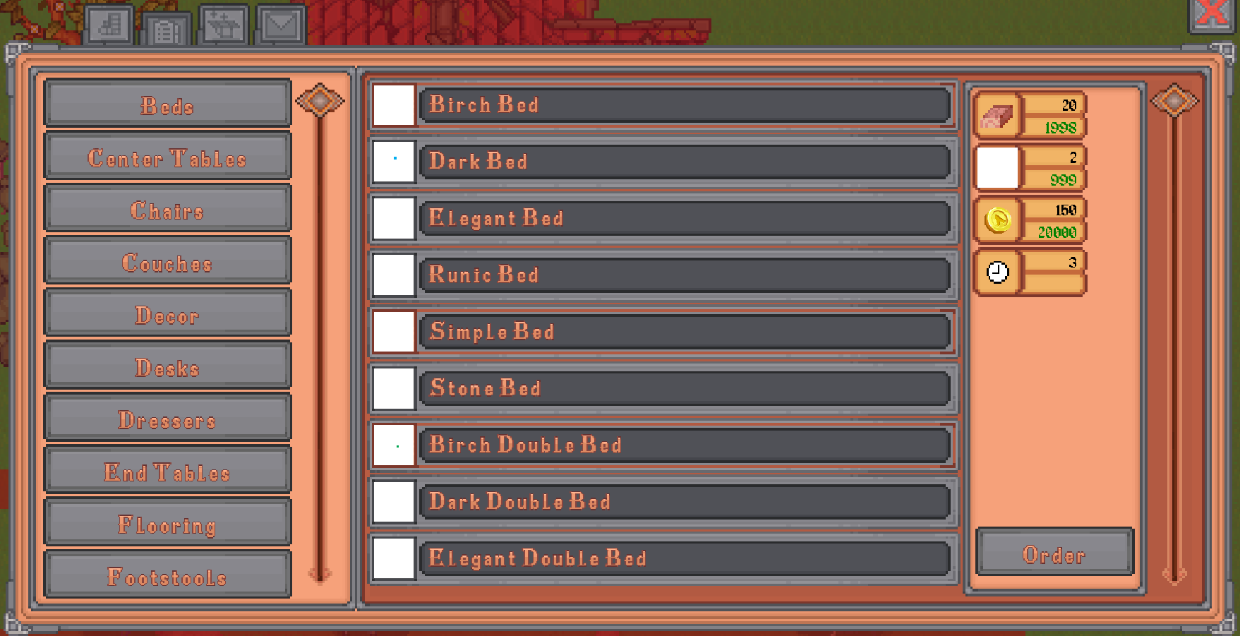
As with the other UI changes I’ve been talking about, the idea is to bring things in line and homogenize the UI. The old UI is very button focused, something that can be annoying for controller players cause there’s just so much moving around through menus. Instead, much like the other UI, sliders have been put in. In addition to that I wanted to try and simplify this UI a bit. The old version is icon overload because you can see the required resources for every item that is visible.
The new version only displays the required resources when you click on one of the items you can order. There’s a slight change in the button UI for each orderable item to indicate if you have the resources or not as well so you won’t need to click on a button just to see if you have what you need.
In addition, once you do select an object you can see what is needed to order it. The required resources are listed along with how much of that resource you have. How much of a resource you have will appear in red or green depending on if you have enough. Hopefully all of this combined will show you what you need at a glance. Also, item icons can be hovered to see the name incase you don’t recognize it.
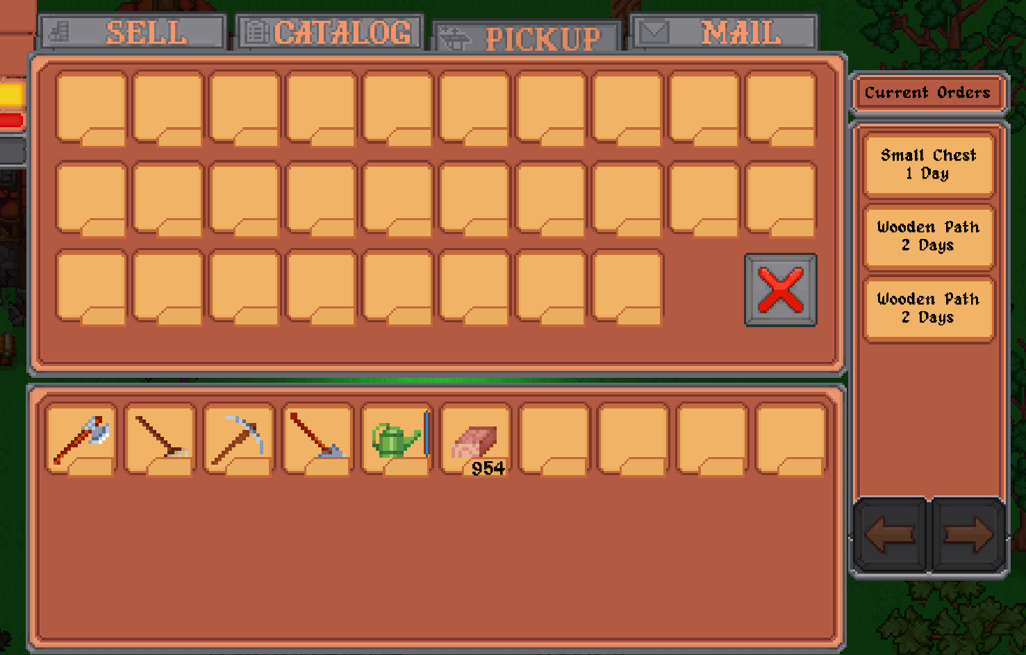
That is shipping in a nutshell. Of course if you can order items you also need to be able to receive them. This is also implemented and has been changed in terms of looks to something that I think is a bit more functional. Again, we’ll start with pictures.
Old Version
New Version
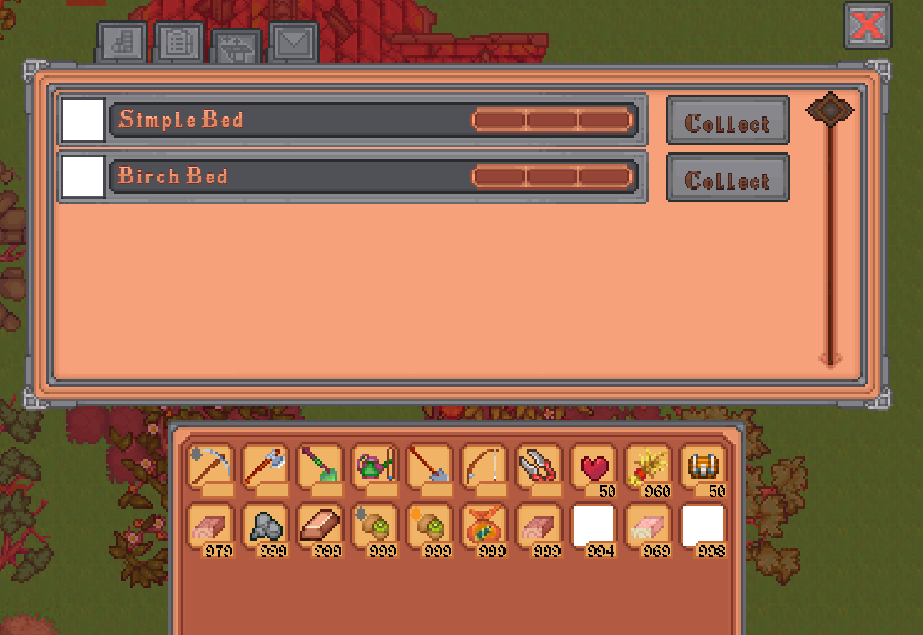
The old version effectively acted like a chest that you could only take items out of. Anything you ordered would eventually appear there and you could grab it. This had a few problems, the most obvious probably being that you could run out of space. Probably unlikely, but it could happen. The other issue was that it just didn’t look very nice.
On top of this the idea to show how long it would be until your item arrived wasn’t thought of until later. Because of that a UI was sort of just stapled onto the side. Its pretty basic and looks about as tacked on as it actually is.
The new version is more straight forward and combines all the info into a neater package. Basically, anything you order will appear in the list. The list can be scrolled and has infinite space so no problems can arise there. The gauge that you see on each item indicates how many days it will take for your item to arrive.
As stated before, there are some obvious pieces of UI that need to go in. Once those pieces get cleaned up I think it will look fairly nice though. If nothing else I think it is functionally a lot better than it used to be.
The last thing is something that I’m still working on although it is coming along quickly which is good. Especially considered how much of a nightmare the old code was. The system currently being made is the dialogue system. That probably doesn’t need to be explained, but basically anything involving talking to an NPC, giving a response, picking topics, starting quests, etc.
Currently you can walk up to an NPC talk to them and go through the conversation to the end. Nothing fancy, but like I said the old code was nightmarish compared to what currently exists. Its all organized much better and everything is a lot cleaner. The old dialogue system ended up being stitched together in many ways because the scope of what it needed to do grew as the game was developed. Since I know what is required from the outset this should be done a lot better.
The other things that got done this month were smaller. Some code was optimized between larger things. Lore for the world is still being written, so much lore. I’ve gotten to the point where the timeline is basically in place for larger world events so bar small things I’m basically on to detailing local lore. As I think I’ve mentioned before there is going to be something akin to a main story for this game. You can entirely ignore it ala Skyrim, but it involves a few hundred years of history in the region so some lore is required.
Lastly the battle system went through some more considerations. It has been fluctuating here and there and will likely continue to until I start development on it. Its too easy to change things when there is no code to prevent me from doing so. Still, I think the small changes and tweaks being made to it are a net positive. A system like that has the potential to really ruin or make a game so I want to do the best I can with it.
Alright, I think that’s it. As usual I’ve probably written too much based on the length of this doc. Thank you all for reading, I’ll have another update in a month as usual.
Get Verdant Village
Verdant Village
A fantasy farming simulation game
| Status | In development |
| Author | Exodus Software |
| Genre | Simulation, Role Playing |
| Tags | 2D, Farming, Life Simulation, Pixel Art, verdantvillage |
| Languages | English |
| Accessibility | Subtitles |
More posts
- March News UpdateApr 01, 2025
- February News UpdateMar 01, 2025
- January News UpdateFeb 01, 2025
- December News UpdateDec 31, 2024
- November News UpdateNov 30, 2024
- October News UpdateNov 01, 2024
- September News UpdateSep 30, 2024
- August News UpdateSep 01, 2024
- June News UpdateJun 30, 2024

Leave a comment
Log in with itch.io to leave a comment.